Posts

Showing posts from May, 2016

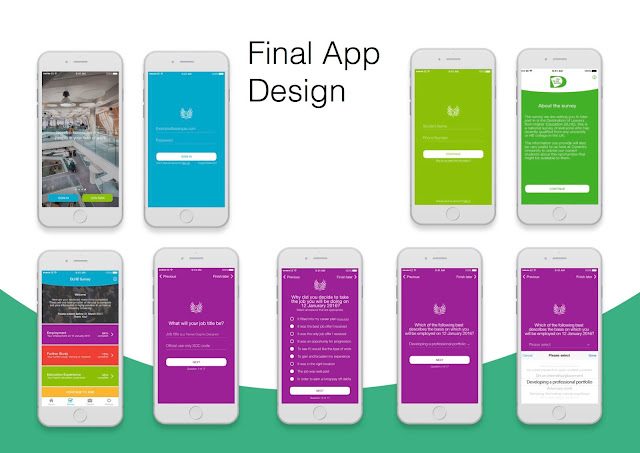
Final App Design

Image
There are more pages to the app but I have a selected few to give an overall view of how it looks. I project I was very grateful to be apart of, I have learnt so much from flat design to meeting the clients requirements.

Finalising the designs

Image
These were my 2 final designs which I showed to the client, to which they preferred the designs with the solid gradient because the text is more legible, especially for the visually impaired. I asked them a few questions such as should arrows be a form of navigation or the 'next' and 'back' button ?  Should the number of pages be displayed at the top or the bottom. and with either feedback which I presented to the team we finalised the design, which will be displayed on the next post.

Questionnaire

Image
While the other members in my group where focusing on the sign up pages, I started to construct the Survey pages. I split the survey into sections, making it easier to fill out rather than doing it all in one go. It also makes it easier to tailor the questions, for instance if you are not going into further education, you wouldn't complete that section of questions.                                   

Sign Up pages

Image
Created more ideas for the client using the preferred imagery as the background and playing with the colours   They favoured another member of my group work which consisted on of using when colour being blue rather that the gradients I was using. However when asking for further feedback by talking to our course mates it comes across to corporate; so they incorporated my use of multi colours.

Something New

Image
An important thing that I have learnt during the course of my live project is the notion of flat design. My ideas are generally untraditional however they can become complicated. I was struggling to simplify a design without loosing the message and aim. Whilst undertaking user interface and app design research I discover that there is a current trend towards minimalism and flat design. However it’s a trend crossing all platforms of design such logo design, animation, furniture even fashion to name a few. I started to look deeper into how I can apply this into to my work, looking at colour, typography and space. Colour I understood and analysed that generally flat design avoids using gradients and textures to create something two dimensional, rather three dimensional. Through research I discovered that monotone, bright and retro colours are the top 3 colours schemes used in flat design. Selecting a colour scheme helps create a  colour palette contributing to ...

Framework

Image
After meeting the clients we decide to come up with ideas to how the pages would be laid out. The trend right now is flat design, consisting of solid colours and minimalism. I went with flat design because it suits our audience seeing as we want the app to be simple. These were my ideas, using san serif font to giving it a young feel, as well as having a lot of white space. Located at the bottom is a progress bar, so the user knows what step they are in the app. We then put our ideas together and came up with an official layout, to which I added colour and images. These are my 2 initial ideas.